
UX & UI Design
Prototyping
digital magazine
ScholasticNews

Project Overview
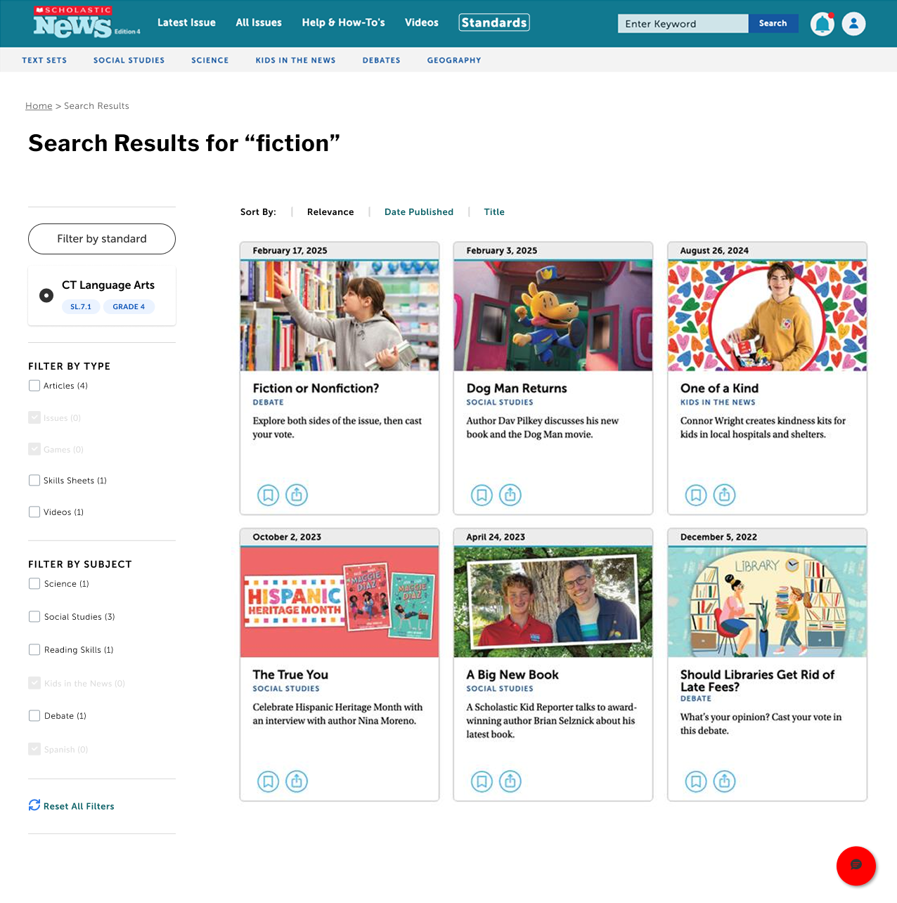
The goal of this project was to add two new experiences to Scholastic Magazine templates that made it easier for teachers to find content aligned with state standards. User testing showed that teachers needed a way to quickly see which magazine articles matched which specific standards, so they could strategically supplement their curriculum. To address this, we designed a dedicated space for browsing standards and a filter to surface relevant content.
Browse Experience
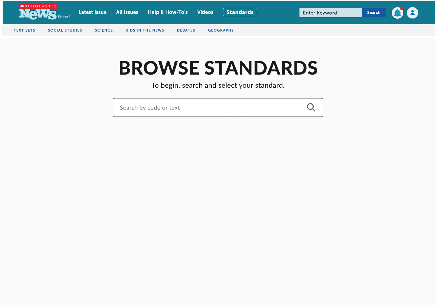
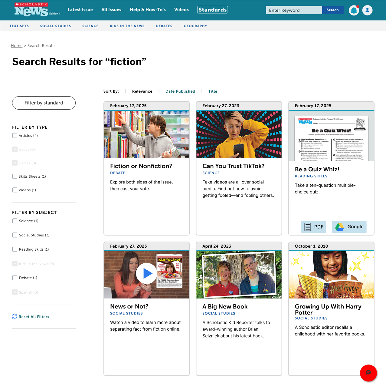
Below are the final screens for the browse experience. I introduced a new navigation link to make this page easy to access.
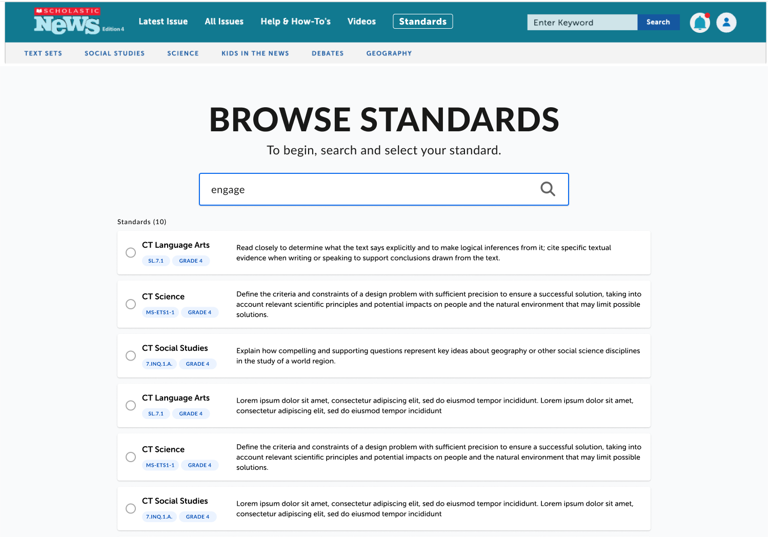
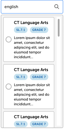
Based on user research, teachers preferred a straightforward search interface, so the page allows them to enter either keywords or standard codes. Search results display the standard code, grade level, and a brief description.
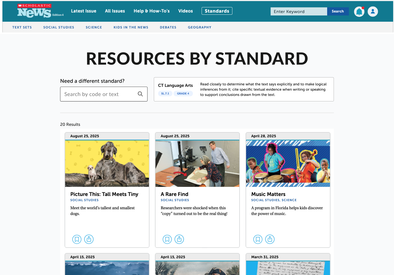
After selecting a standard, teachers are shown all resources tagged to it. This flow creates value by letting teachers start with the standard they need to cover, then discover the most relevant supporting resources.
standards search page

browse standards results

resources by standard
Filter Experience
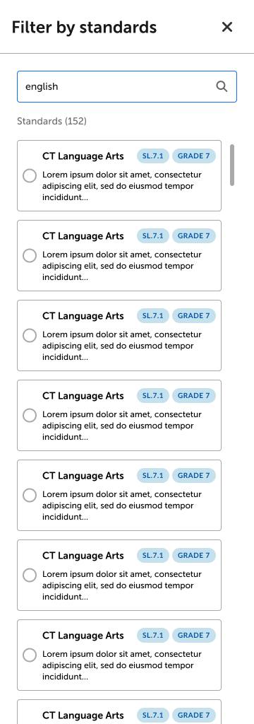
Lastly, I designed the filtering experience. After iterating through several approaches, including a dropdown and a drawer (left), I landed on a modal (below). The modal offered the most intuitive interaction and made the best use of space.
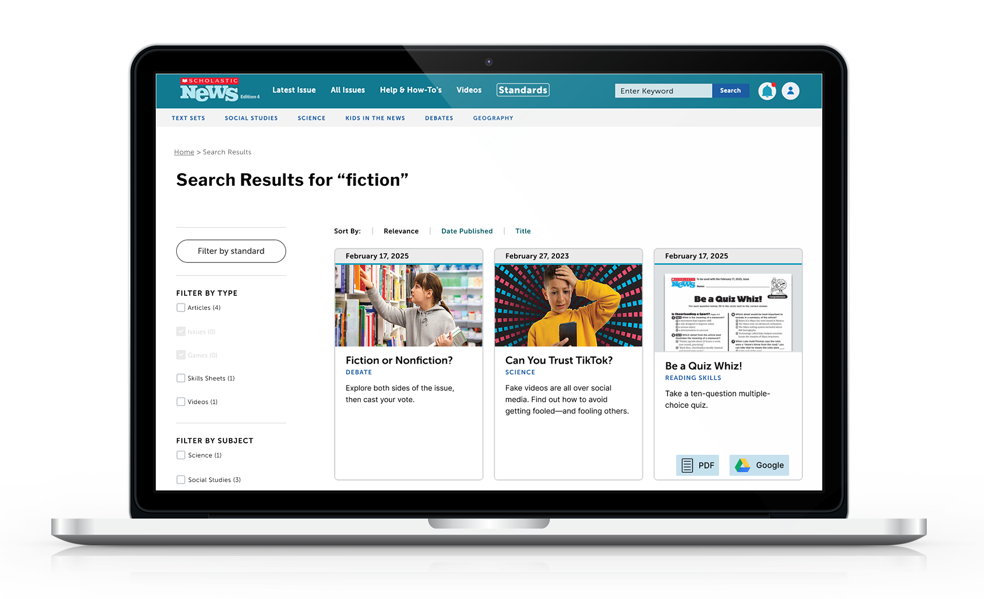
Users first navigated to the search page and entered keywords. From there, they could open the standards modal via the “Filter by Standards” button, select their preferred standard, and refine their results.
dropdown iteration
Drawer iteration
search page
standards filter modal
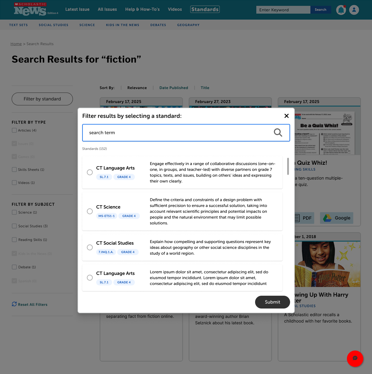
selected standard


home
UX & UI Design
Prototyping
digital magazine
Scholastic News

Project Overview
The goal of this project was to add two new experiences to Scholastic Magazine templates that made it easier for teachers to find content aligned with state standards. User testing showed that teachers needed a way to quickly see which magazine articles matched which specific standards, so they could strategically supplement their curriculum. To address this, we designed a dedicated space for browsing standards and a filter to surface relevant content.

Browse Experience
Below are the final screens for the browse experience. I introduced a new navigation link to make this page easy to access.
Based on user research, teachers preferred a straightforward search interface, so the page allows them to enter either keywords or standard codes. Search results display the standard code, grade level, and a brief description.
After selecting a standard, teachers are shown all resources tagged to it. This flow creates value by letting teachers start with the standard they need to cover, then discover the most relevant supporting resources.
standards search page

browse standards results

resources by standard
dropdown iteration
Drawer iteration
Filter Experience
Lastly, I designed the filtering experience. After iterating through several approaches, including a dropdown and a drawer (left), I landed on a modal (below). The modal offered the most intuitive interaction and made the best use of space.
Users first navigated to the search page and entered keywords. From there, they could open the standards modal via the “Filter by Standards” button, select their preferred standard, and refine their results.
search page

standards filter modal

selected standard

home
UX & UI Design
Prototyping
digital magazine
Scholastic News

Project Overview
The goal of this project was to add two new experiences to Scholastic Magazine templates that made it easier for teachers to find content aligned with state standards. User testing showed that teachers needed a way to quickly see which magazine articles matched which specific standards, so they could strategically supplement their curriculum. To address this, we designed a dedicated space for browsing standards and a filter to surface relevant content.
Browse Experience
Below are the final screens for the browse experience. I introduced a new navigation link to make this page easy to access.
Based on user research, teachers preferred a straightforward search interface, so the page allows them to enter either keywords or standard codes. Search results display the standard code, grade level, and a brief description.
After selecting a standard, teachers are shown all resources tagged to it. This flow creates value by letting teachers start with the standard they need to cover, then discover the most relevant supporting resources.
standards search page

browse standards results
resources by standard
dropdown iteration
drawer iteration
Filter Experience
Lastly, I designed the filtering experience. After iterating through several approaches, including a dropdown and a drawer (left), I landed on a modal (below). The modal offered the most intuitive interaction and made the best use of space.
Users first navigated to the search page and entered keywords. From there, they could open the standards modal via the “Filter by Standards” button, select their preferred standard, and refine their results.
search page
standards filter modal
