
UX & UI Design
A Duo to Talk About

Project Overview
I had the chance to contribute to the development of the "A Duo To Talk About" website update, specifically focusing on new branding elements.
"A Duo To Talk About" offers a comprehensive dual treatment featuring BOTOX® Cosmetic and the JUVÉDERM® Collection of Fillers.
The website underwent a complete redesign, with fresh copy, beautiful new product and patient photography, an updated color palette, and a revamped layout. My role in this update was to enhance the user interface design using the new visual identity.
Design Process
1 // DISCOVERY
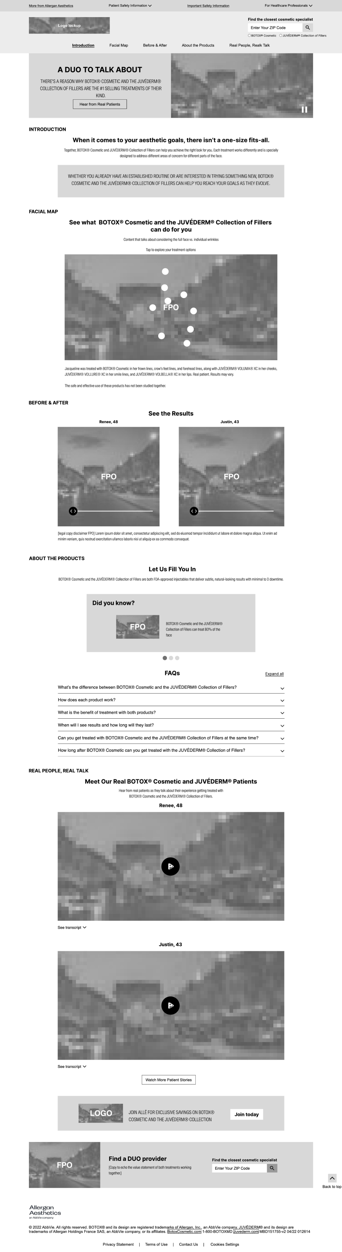
These are the initial wireframes for the home page. They feature functionalities such as before-and-after image toggles, text sliders, accordions, and videos.

2 // DEFINING THE PROBLEM
The most important part of this project was fleshing out the design from wireframes to high fidelity by transforming the basic structural layout into a polished, visually appealing, and fully functional design. I applied a cohesive color palette, new typography, and high-quality images and icons.
wireframe

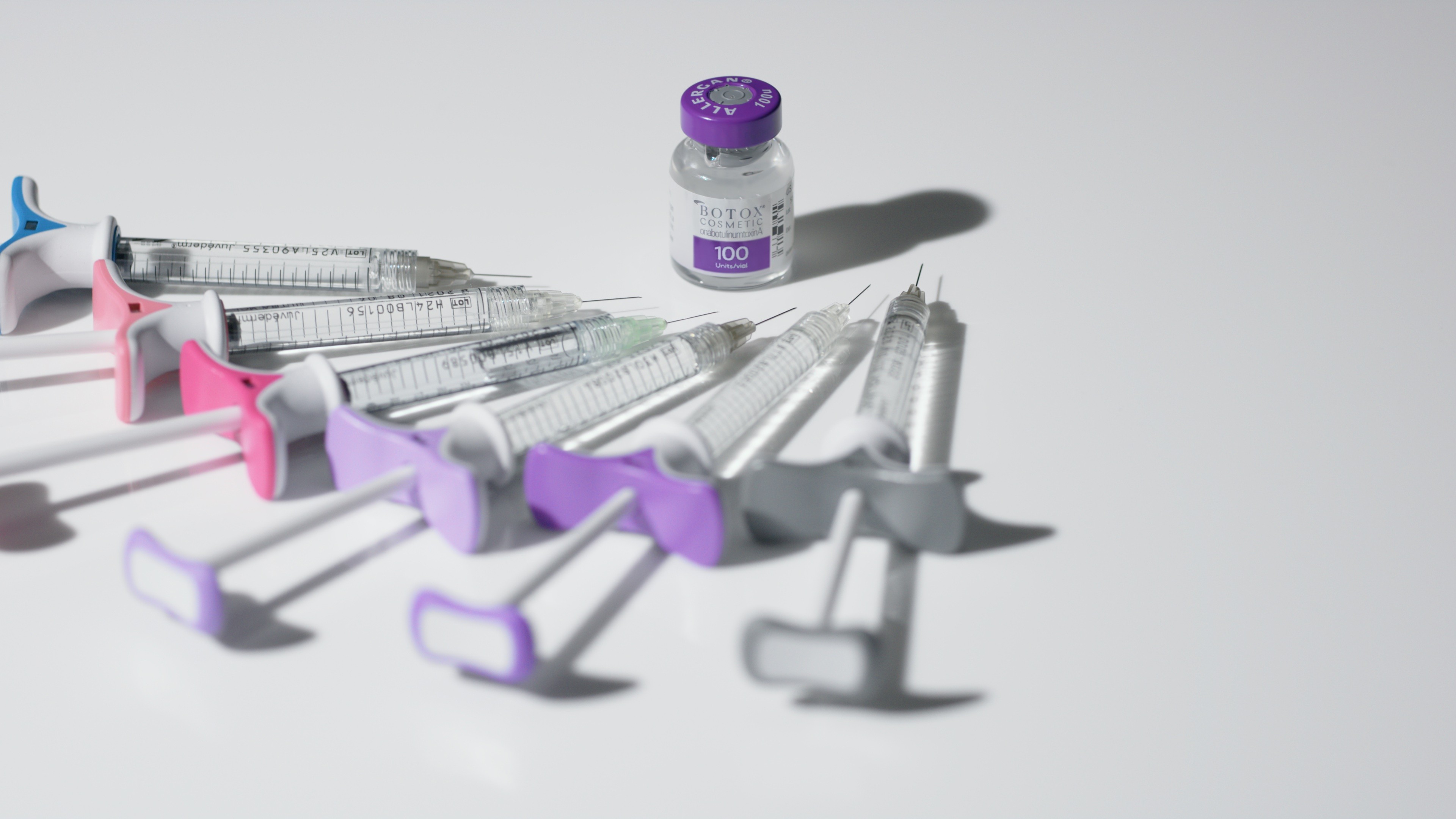
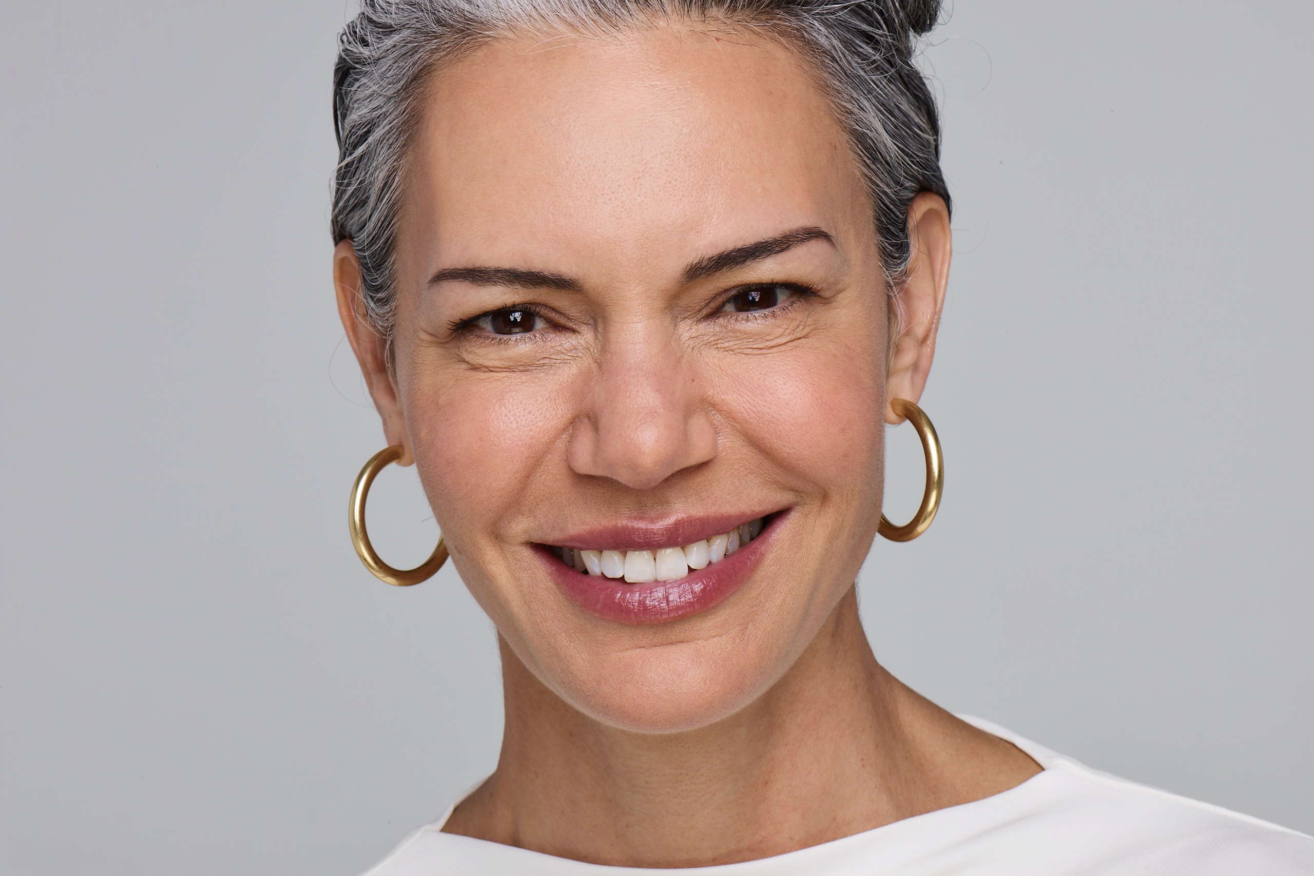
Imagery

High FidelityDesigns
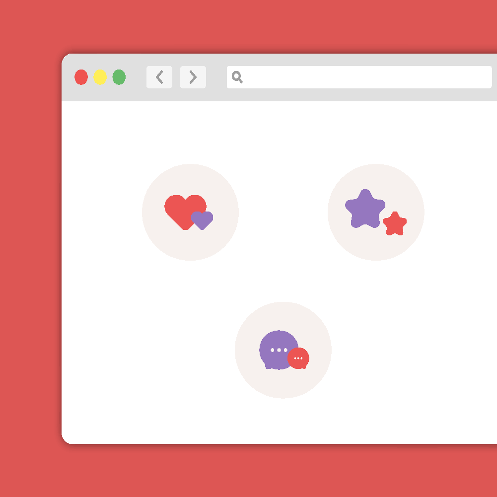
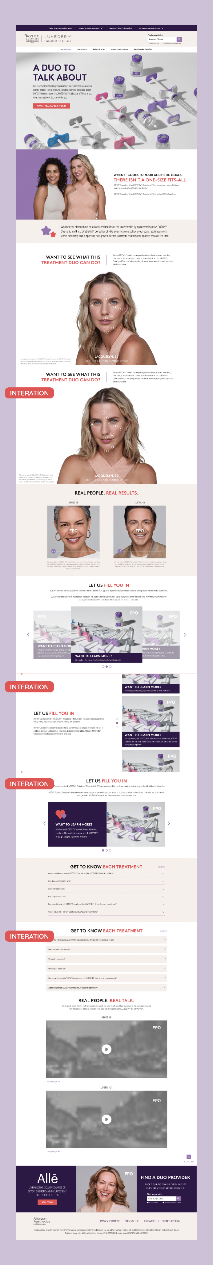
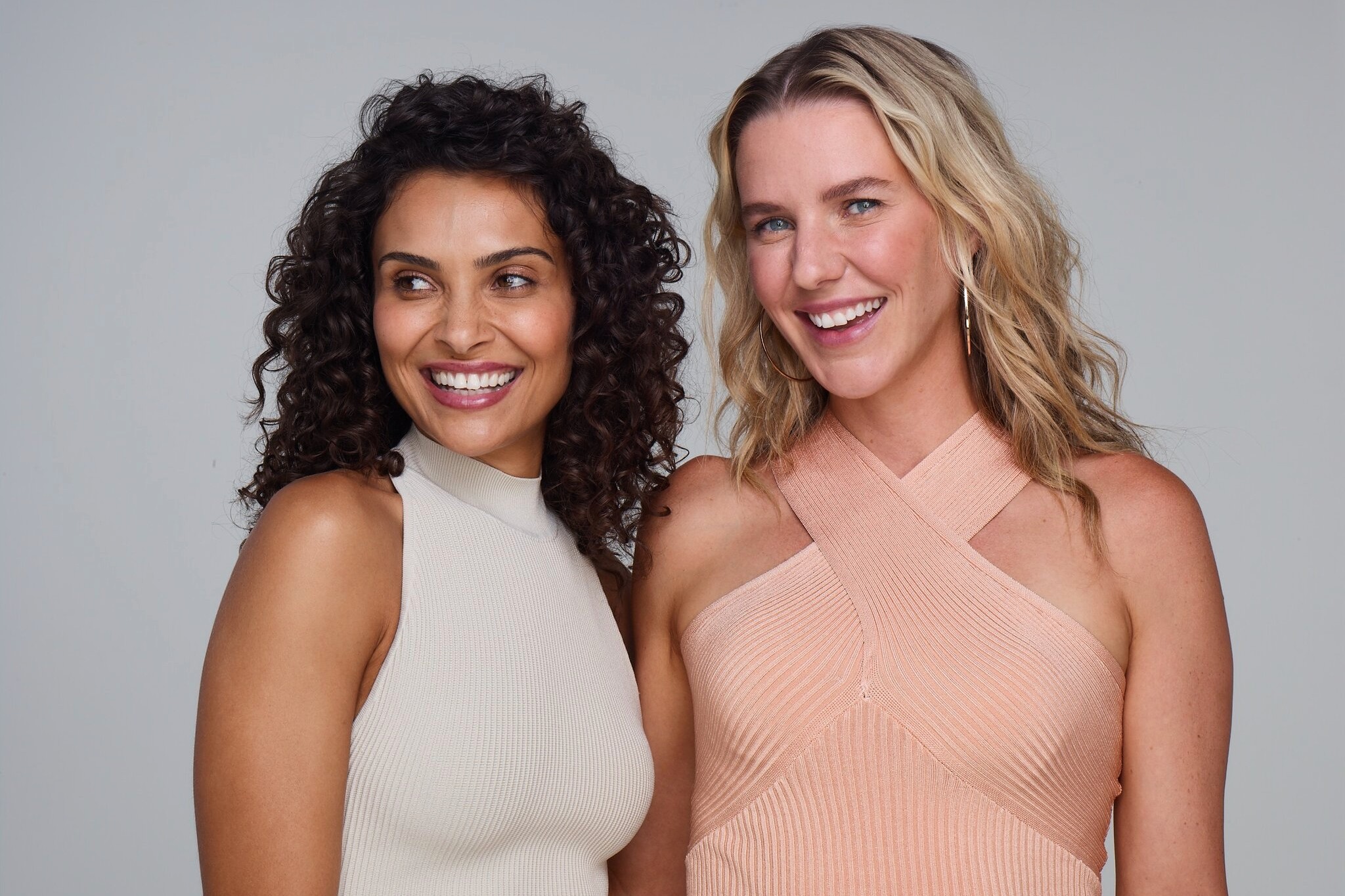
This is the high-fidelity design I developed. The new patient photography is vulnerable yet beautiful, showing clear before-and-afters of real patients who use the products. Using an icon style with soft shapes, rounded edges, and gentle curves gives the site a friendly and approachable feel. The playful details, such as hearts and stars, add whimsy and charm.

2 // DESIGN SOLUTIONS
I iterated on several key functionalities, such as a slider that displays text and images. I included options that slide vertically and horizontally, for a subtly different look and feel. Overall, the design is fun and feminine, attracting the type of persona likely to use these products.
Icon Style
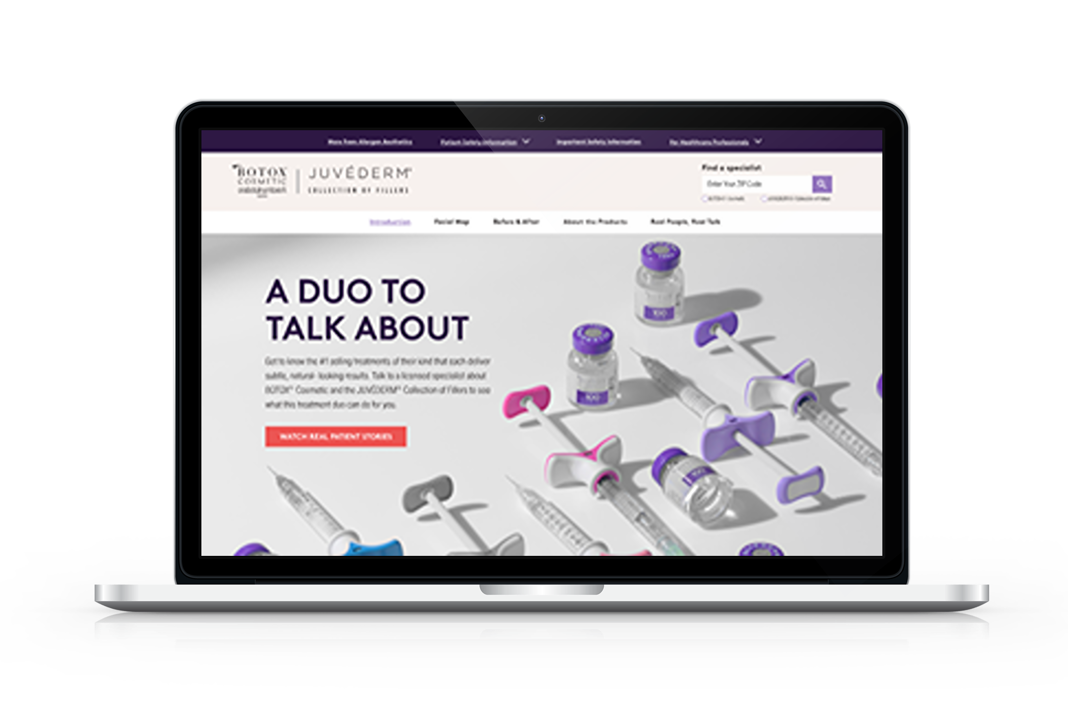
Home Page


home
UX & UI Design
A Duo to Talk About

Project Overview
I had the chance to contribute to the development of the "A Duo To Talk About" website update, specifically focusing on new branding elements.
"A Duo To Talk About" offers a comprehensive dual treatment featuring BOTOX® Cosmetic and the JUVÉDERM® Collection of Fillers.
The website underwent a complete redesign, with fresh copy, beautiful new product and patient photography, an updated color palette, and a revamped layout. My role in this update was to enhance the user interface design using the new visual identity.
Design Process
1 // DISCOVERY
These are the initial wireframes for the home page. They feature functionalities such as before-and-after image toggles, text sliders, accordions, and videos.

2 // DEFINING THE PROBLEM
The most important part of this project was fleshing out the design from wireframes to high fidelity by transforming the basic structural layout into a polished, visually appealing, and fully functional design. I applied a cohesive color palette, new typography, and high-quality images and icons.
wireframe
Imagery
Home page

High Fidelity Designs
This is the high-fidelity design I developed. The new patient photography is vulnerable yet beautiful, showing clear before-and-afters of real patients who use the products. Using an icon style with soft shapes, rounded edges, and gentle curves gives the site a friendly and approachable feel. The playful details, such as hearts and stars, add whimsy and charm.

2 // DESIGN SOLUTIONS
I iterated on several key functionalities, such as a slider that displays text and images. I included options that slide vertically and horizontally, for a subtly different look and feel. Overall, the design is fun and feminine, attracting the type of persona likely to use these products.
Icon Style
home
UX & UI Design
A Duo to Talk About

Project Overview
I had the chance to contribute to the development of the "A Duo To Talk About" website update, specifically focusing on new branding elements.
"A Duo To Talk About" offers a comprehensive dual treatment featuring BOTOX® Cosmetic and the JUVÉDERM® Collection of Fillers.
The website underwent a complete redesign, with fresh copy, beautiful new product and patient photography, an updated color palette, and a revamped layout. My role in this update was to enhance the user interface design using the new visual identity.
Design Process
1 // DISCOVERY
These are the initial wireframes for the home page. They feature functionalities such as before-and-after image toggles, text sliders, accordions, and videos.

2 // DEFINING THE PROBLEM
The most important part of this project was fleshing out the design from wireframes to high fidelity by transforming the basic structural layout into a polished, visually appealing, and fully functional design. I applied a cohesive color palette, new typography, and high-quality images and icons.
wireframe
Imagery
Home Page
High Fidelity Designs
This is the high-fidelity design I developed. The new patient photography is vulnerable yet beautiful, showing clear before-and-afters of real patients who use the products. Using an icon style with soft shapes, rounded edges, and gentle curves gives the site a friendly and approachable feel. The playful details, such as hearts and stars, add whimsy and charm.

3 // DESIGN SOLUTIONS
I iterated on several key functionalities, such as a slider that displays text and images. I included options that slide vertically and horizontally, for a subtly different look and feel. Overall, the design is fun and feminine, attracting the type of persona likely to use these products.