QULIPTA Quiz

Project Overview
I recently had the opportunity to contribute to the development of the QULIPTA website update, specifically focusing on an online quiz designed to help users assess their symptoms related to migraine. This interactive quiz is an integral part of the QULIPTA Discussion Guide page, aimed at helping users to better understand and communicate their migraine experiences. My role on this update was to update the user interface design as well as complete the protoyping and interaction design.
This quiz is an important feature of the QULIPTA website because it helps users discuss their treatment plan with their doctor. Knowing specific symptoms can guide the doctor in choosing the most effective treatment. Overall, providing detailed symptom information enables doctors to make informed decisions about medication and treatment strategies, ultimately leading to better outcomes for the patient.
Wireframes
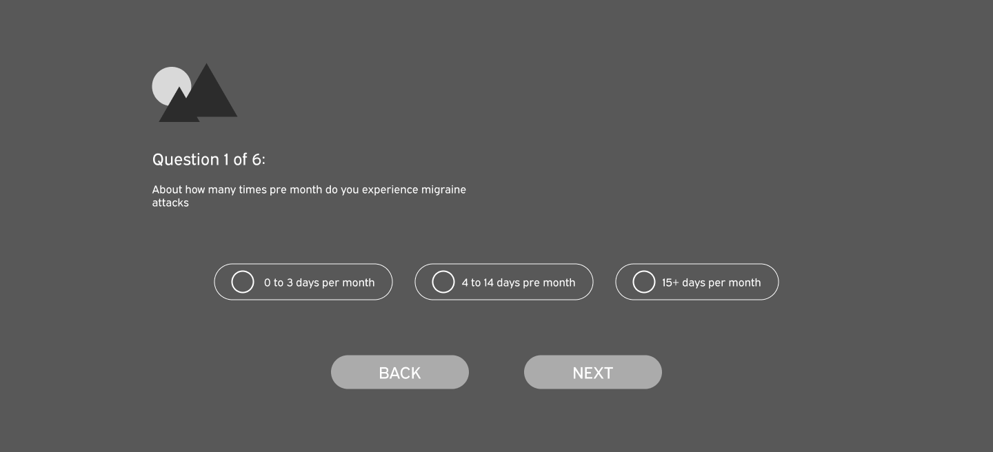
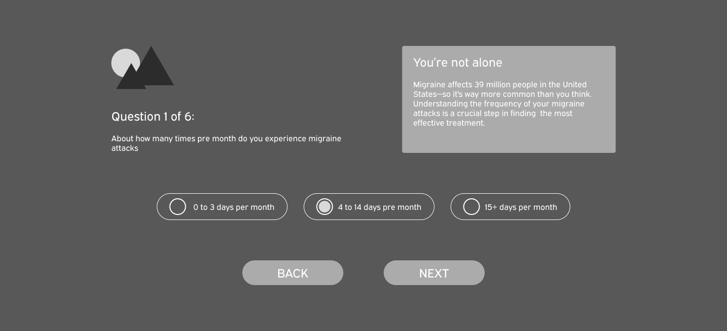
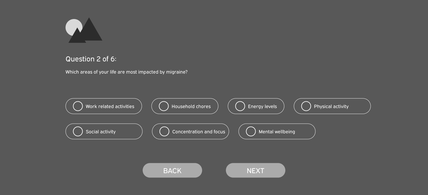
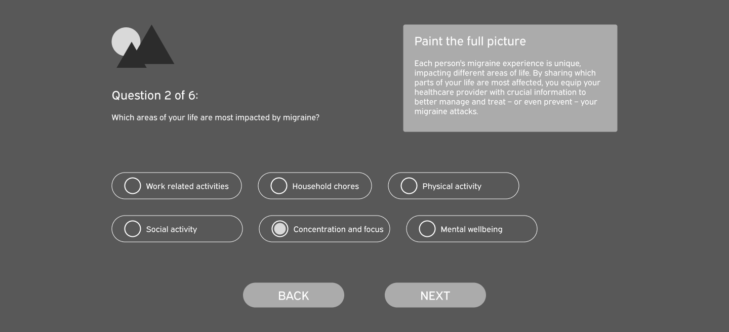
These are wireframes for an online quiz about a user’s symptoms and experience with migraines. The answers are collected and compiled into a PDF that can be printed and brought to the user's doctor’s appointment.
The selectable answers are formatted as radio buttons. When a user selects an answer to a question, they receive additional content and the option to proceed to the next question. The additional content for each question is the same, regardless of which answer the user selects.
Question 1
Question 1 selection
Question 2
Question 1 selection
Figma Prototype
Design Process
// exploration
This is the initial draft utilizing the functionality outlined in the wireframes. The quiz content remains within the orange box, and the user never leaves this page. I created each quiz answer as a variant of the 'Quiz' component, so when clicked, the NEXT button changes to the next variant using 'change to' in Figma. The BACK button switches the variant to the previous one.
// DEFINING THE PROBLEM
There are several aspects of this version that need improvement. Firstly, remaining on the same page creates a confusing experience. The BACK and NEXT controls feel inconsistent and counterintuitive. The animations are abrupt, and the visual design needs improvement.
Click the GET STARTED button to begin the Figma prototype flow.
High Fidelity Designs
I iterated on the initial design and made some key changes that make the experience feel easier and more intuitive.
// DESIGN SOLUTIONS
I suggested moving the quiz to its own dedicated landing page because I found it unintuitive to move and change content within a callout. I reworked the visual design while maintaining the functionality of each answer as a variant of the overall component.
Additionally, I added animations so that instead of the additional content and NEXT button appearing instantly, they slide down for a smoother experience. I also enabled selected poll answers to navigate back to the previous variant, allowing users to select and deselect their answers.
Click the GET STARTED button to begin the Figma prototype flow.